How to Analyze the Grid Representation in Heat Maps
Follow the steps below to navigate and understand the Heat Maps section in the Time Tracker module of Time Champ:
Step 1:
Log in to your Time Champ account.
Step 1:
Log in to your Time Champ account.
Under the Time Tracker section, click on Heat Maps.
The Heat Map Dashboard will appear, displaying user activity insights in a visual format.
Step 2:
The Heat Maps section provides a graphical representation of user activity.
It shows the percentage of time each user has been active and present during their working hours.
The data is displayed in a color-coded heat map format, making it easy to identify patterns of user activity and attendance.
Darker or more intense colors generally indicate higher activity levels, while lighter colors represent lower activity or idle time.
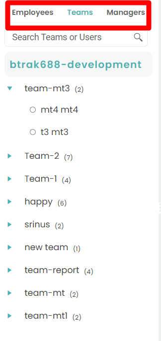
Step 3:
You can view Heat Map data based on different organizational levels:
Employees
Teams
Managers
The Heat Maps section provides a graphical representation of user activity.
It shows the percentage of time each user has been active and present during their working hours.
The data is displayed in a color-coded heat map format, making it easy to identify patterns of user activity and attendance.
Darker or more intense colors generally indicate higher activity levels, while lighter colors represent lower activity or idle time.
Step 3:
You can view Heat Map data based on different organizational levels:
Employees
Teams
Managers